
Monday, March 26, 2012

Thursday, February 9, 2012
2/9/12
During this period I worked on my page, adding captions, rearranging photos, all that chet. I still need to take more pictures on Friday to fill in a couple of empty image slots.
Wednesday, January 11, 2012
Photography Concepts
Depth of Field:

Negative Space:

Symmetry:

Balance:
 Repetition:


Fill the Frame:

Leading Lines:


Negative Space:

Symmetry:

Balance:


Rule of Thirds:

Depth:

Unusual Angle:


Leading Lines:

Friday, December 16, 2011


If I had to pick a favorite photography concept it would be unusual angle. This concept can make a simple object look much more appealing. It is simple to do this style of photography and I feel like I am getting better and better at it. Above are two picture of an can I took. By adding in an interesting angle the picture becomes much more attractive.
Monday, December 12, 2011
Sub Day 12/09/11
On this sub day I worked on my senior icon. It took me the whole class to finish the icon because I added so much content to the icon.
Thursday, December 8, 2011

Friday, October 28, 2011
Sub Day
On the Sub Day I was called out of class to help a teacher with the Girls Football Game. After coming back I started working on my test. After my test I used the remaining time to work on my business card.
Today
Today in Jeeerbook I worked on my page in Studio Works. I added the picture boxes and contemplated what the design was going to be. So I kept it simple so in the future I can make changes if needed.
Wednesday, October 26, 2011

Monday, October 24, 2011
Business Card Designs + Elements of Design


The basic elements of design consist of line, shape, texture, space, size, value, and color. Using these elements correctly can result in an attractive layout that is appealing to the viewer. All 5 business cards above show good examples of an attractive well thought design.
Negative Space
Negative Space is the empty space around the subject in a photograph. This empty can be used to the photographers advantage to make the picture look more appealing. The focus should still be on the subject of the photo but there is a balance between the subject and the negative space.


Friday, September 23, 2011

Monday, September 19, 2011
Photo Evaluation

 This photo demonstrates Repetition.
This photo demonstrates Fill in the Frame.

This photo demonstrates Leading Lines.

Tuesday, September 13, 2011
Photo Scavenger Hunt
Fill the Frame:


Repetition:

Symmetry:

Rule of Thirds:

Balance:

Leading Lines:

Depth of Field:

Unusual Angle:

Depth:

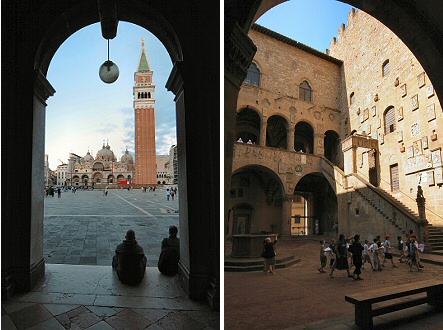
Framing:
Wednesday, September 7, 2011

Wednesday, August 31, 2011
Photo Evaluations


Subscribe to:
Posts (Atom)